Support, designed as a system.
How a direct-to-consumer pharmaceutical platform supports millions of people, across every brand it sells.
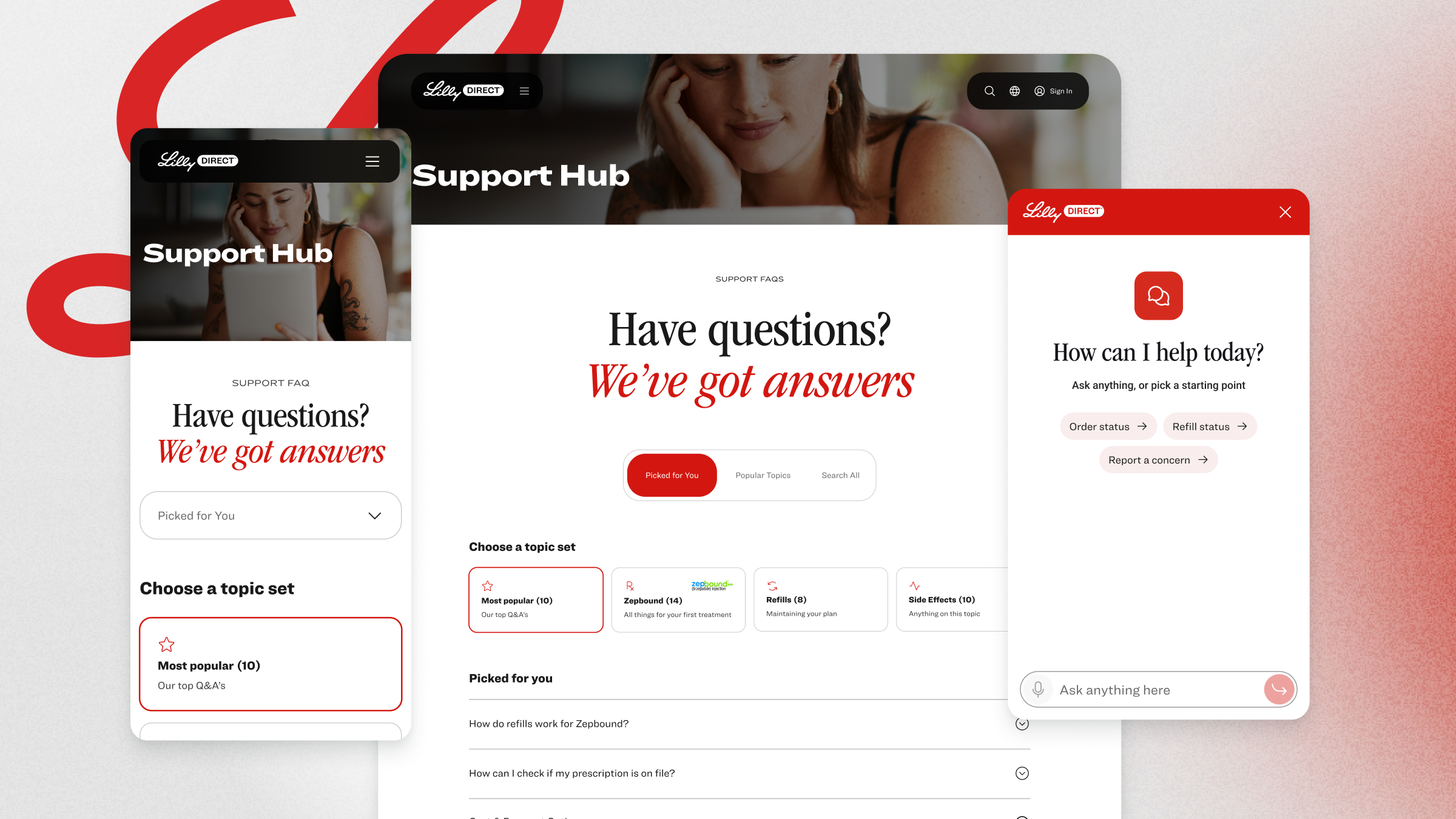
LillyDirect is Lilly's direct-to-consumer platform: a prescription arrives from a doctor, a person verifies it, enrolls, pays, and gets medicine at home or at a partner pharmacy, then refills for months. There is no counter to walk up to. Every question a pharmacist would have answered in person has to be answered by the product, by a conversation, or by a human on the phone. My remit as design lead was support as an organizational approach, not a help page: how a platform built for millions of people, carrying every medicine Lilly offers directly, answers before people ask, resolves when they do, and hands off to a human without anyone repeating themselves. Built on Genesys Cloud and Salesforce under a fully customized front end.
A pharmacy with no counter.
Support is a cost line and a care promise at the same time.
The cheapest support contact is the one that never needs to happen. The design job is making that feel like care, not deflection.
Every medicine plays by different rules.
Clinical facts, storage, regulation, device. One support system had to hold as the catalog grew, without a rebuild per medicine.
The moment is the brief.
The same person needs different help at verification, at checkout, on delivery day, and in month three — and arrives through eight different doors, from a doctor's text to an abandoned payment to a refill.
Five support pillars
We took a holistic approach to support: help in the moment, help before you know you need it, help when you ask for it, and one place for questions and answers. Self-service first, a human in the mix when it matters. We landed on five pillars:
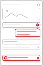
01. Contextual
Help that lives inside the page — tooltips, accordions, modals, bottom sheets — each matched to a moment. Most questions get answered before they are asked.
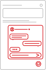
02. Chat
A context-aware conversation one tap away, with humans behind it. The resolution layer.
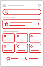
03. Support Hub
One destination for every question, organized around the person's prescription and stage, with chat and phone in the same place.
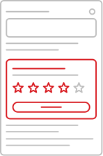
04. Feedback
Invitations to tell us how it went — in the moment, after the conversation, across the arc of treatment. The strategy's own data source.
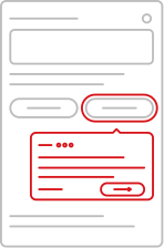
05. Tours
A guided layer that walks a person through a new moment, at onboarding and in context. Snackable, not a manual.
The moves that made the strategy real
01 · Mapping Journeys
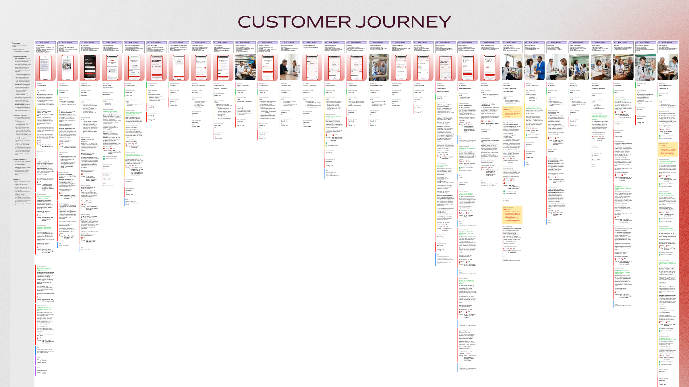
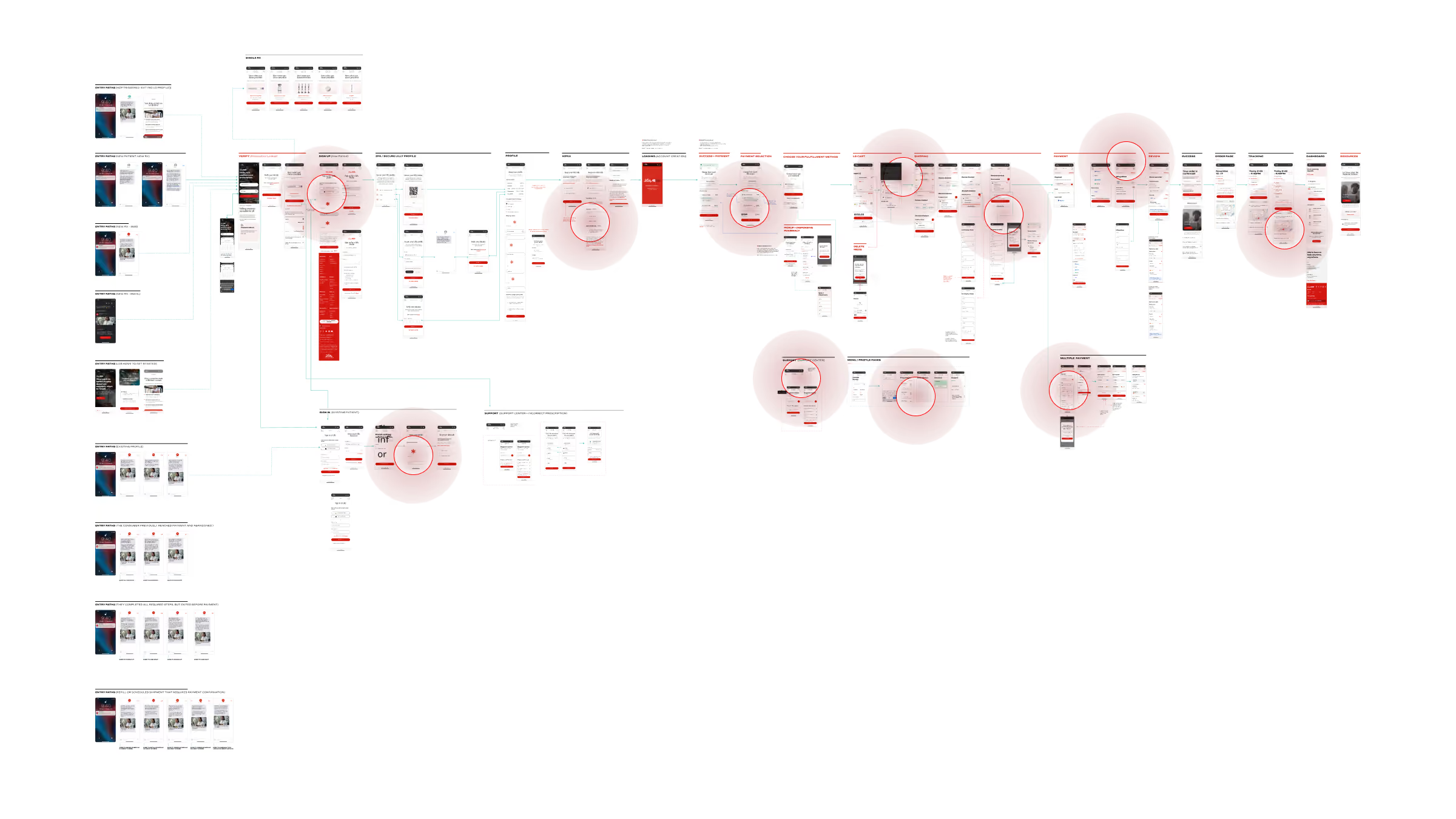
Mapping the key journeys gave us a top-down view of where people would need help. This is one of them: every step tied to a stage in the funnel, with callouts for the events and features the support strategy had to cover.
02 · Contextual
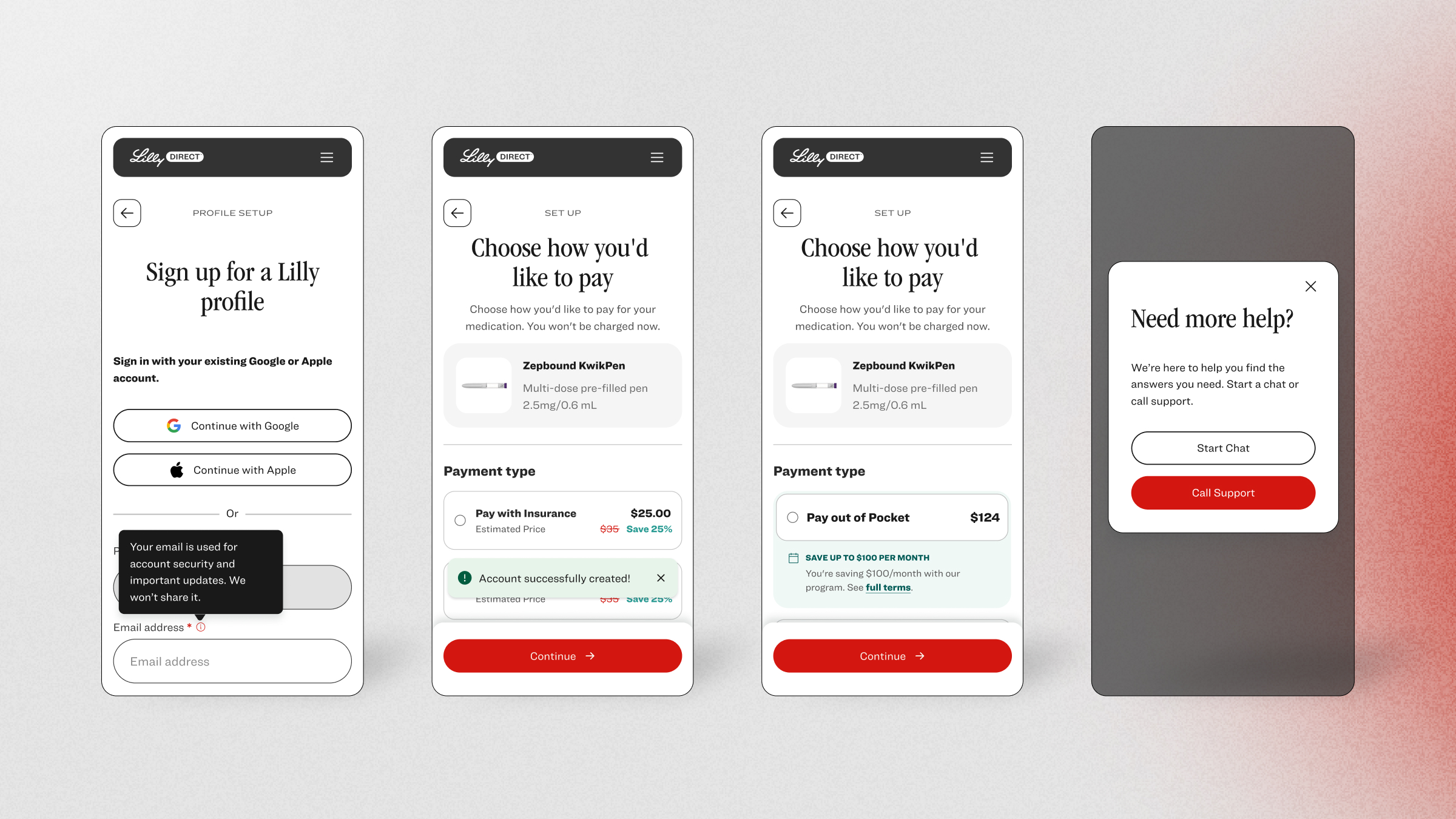
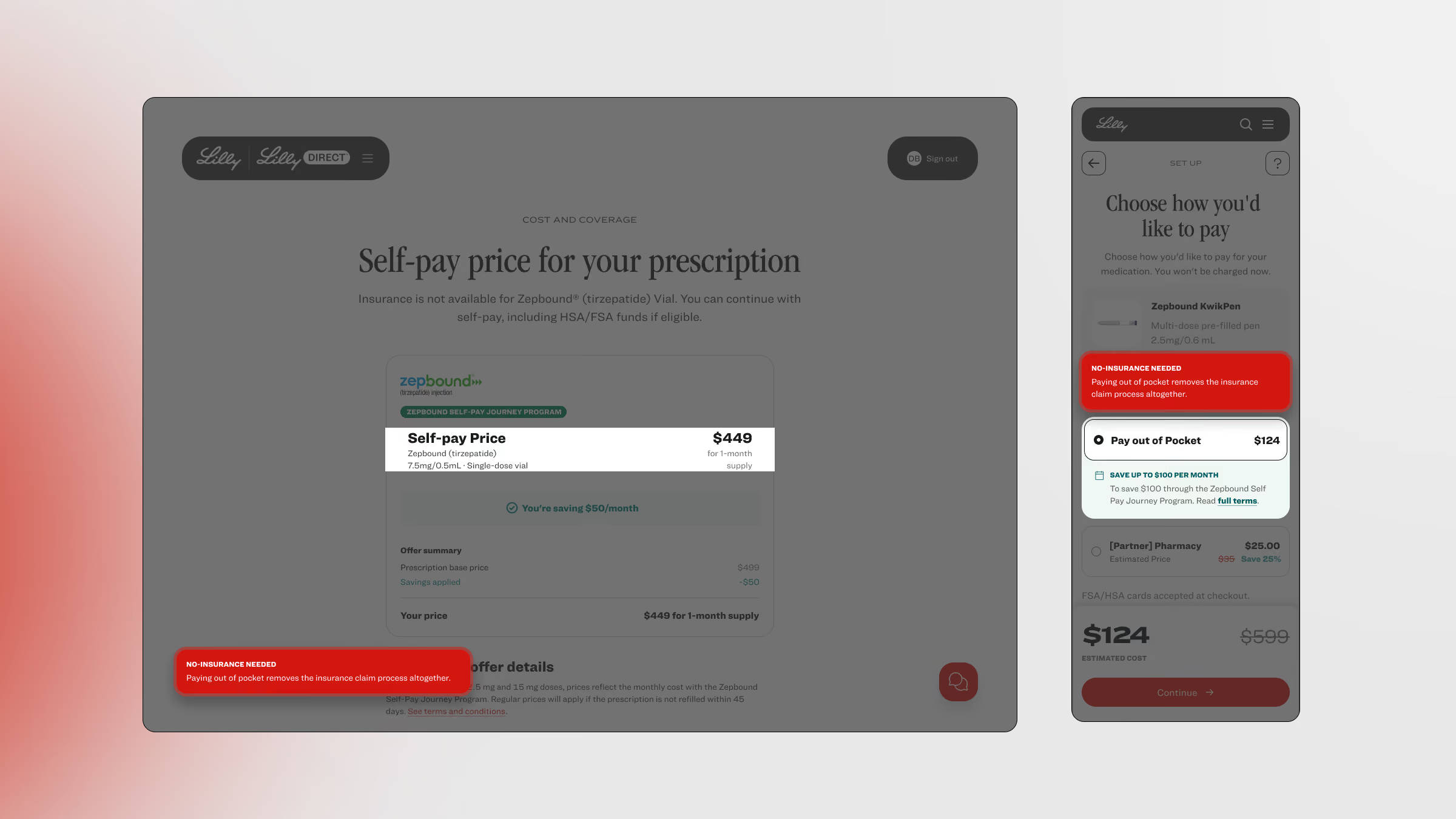
Support in the moment. Tooltips, toasts, modals, banners and bottom sheets drive awareness and make the job to be done at each stage clearer.
03 · Support Hub
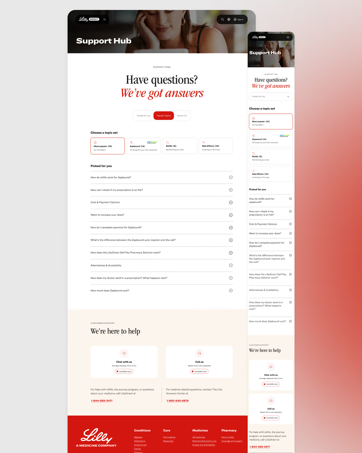
Three ways in, on one domain: picked for you (prescription- and stage-aware), popular topics (ranked by real demand — the top topic carried five times the next), and search for the long tail. Chat and phone sit in the same band. Personalization as information architecture.
04 · Chat
Demand data decided where chat earns its place in the journey. A feasibility map decided what shipped first, what needed custom work, and what waits. The hand-off to a human was designed as a feature. The chat experience is its own case study.

05 · Feedback
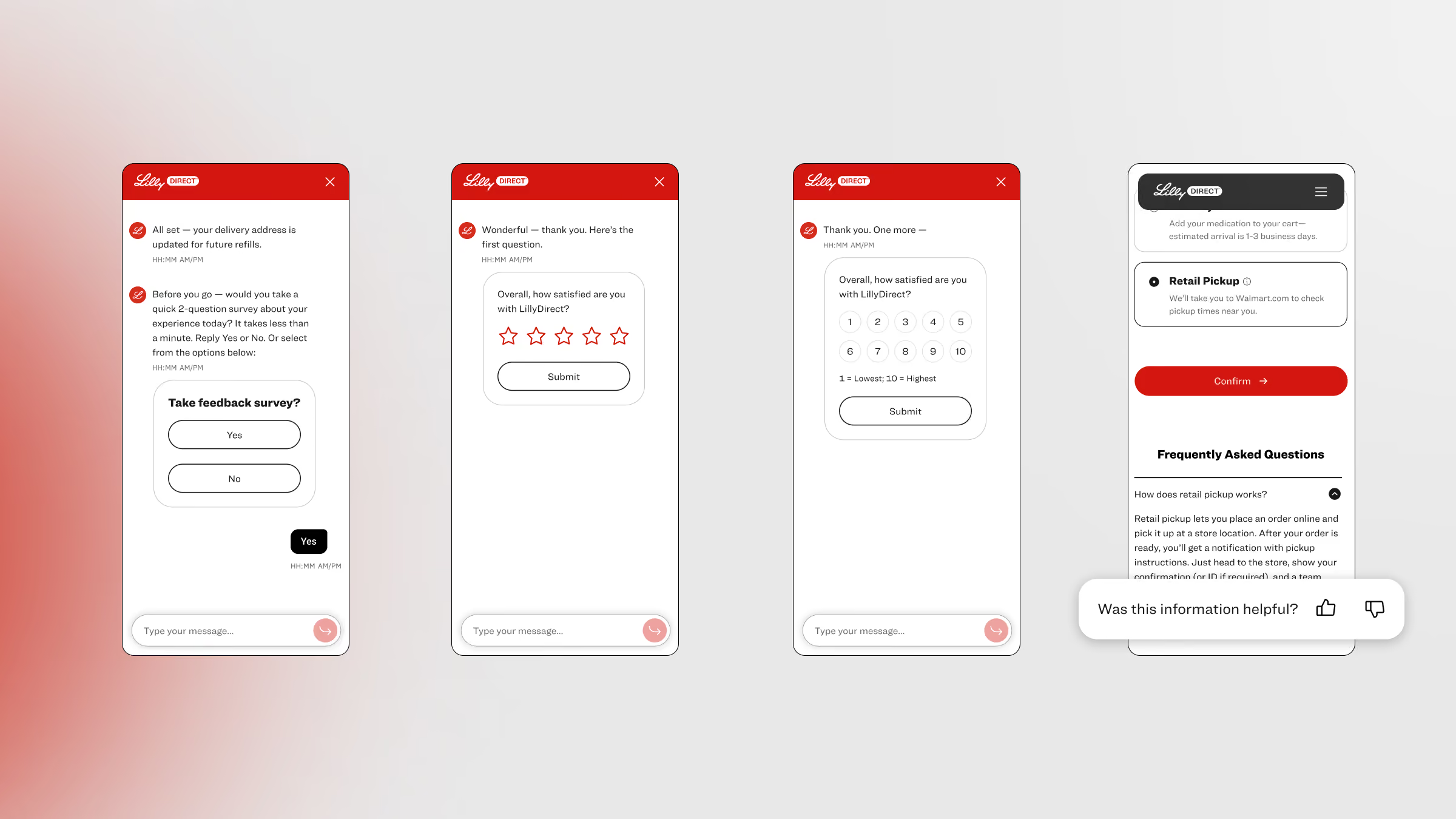
Asking people how it went gave us free insight into how they felt at each stage of the journey — the signal that shapes what we pivot and improve next.
06 · Tours
Onboarding with delight. A snackable way to learn a new screen at the key stages of the journey.
What the strategy produced
- The five-pillar support strategy and its alignment deck
- Detailed journey maps with proactive and reactive messaging, governance, and pillar tagging on every step
- The channel strategy and a platform feasibility map: supported, custom, later
- The contextual family — tooltips, transient elements, modals, bottom sheets, accordions
- The Support Hub: A place for answers and doors to get where you need to go
- The in-chat feedback conversation and the post-delivery feedback loop
- The agentic chat experience, specified end to end (its own case study)
Status: pre-launch. The support system launches with the platform; in-market results follow. The chat experience is its own case study: LillyDirect Agentic Chat.
Design-phase indicators
pillars, one system
journey steps mapped before the help center was designed
ways into the Support Hub
the top support topic's demand over the next
Four things I took forward.
Support is more than a phone number.
Five pillars are five features until each one names the others as its doors. The entry points were the design.
Start where the data says people get stuck.
The journey map and the demand data decided where support appeared; the help center came last.
Write the small rules too.
A principal who sets the channel strategy and also writes the tooltip rule is why the system holds when the catalog grows.
A human is always one hand-off away.
Self-serve, chat, and phone are one system; no layer is a dead end, and nobody repeats their issue.