Chat platform for millions
Designing the LillyDirect chat experience end to end.

Self-service that feels like care.
LillyDirect is Lilly's direct-to-consumer platform, and self-service is a core business driver: every need resolved in chat cuts cost without cutting care. My remit ran the full stack — channel strategy, interaction architecture, element-level specs — grounded in what patients actually ask. Real help-center demand set the scope; refills led by a factor of five.
Chat is one of five layers in the platform's support strategy, and that story is its own case. This one goes deep on the chat layer through the six things that left the engagement: the scenario matrix, the voice, the design system, the experience, the hand-off, and the measurement frame.
A chat that has to do things, safely.
A care task can't live in a chat bubble.
Bubble-in, bubble-out AI produces walls of text. But patients need to do things: refill, verify, pay, track. Conversation had to become a workspace, not a transcript.
Trust is regulated.
No clinical advice. Adverse-event routing. A source behind every response. In pharma, a hallucination isn't a bug. It's a safety event.
The bot must never strand a patient.
Every dead end is a design failure. Escalation to a human had to be designed as an outcome, not a fallback.
Create a framework to accommodate many scenarios.
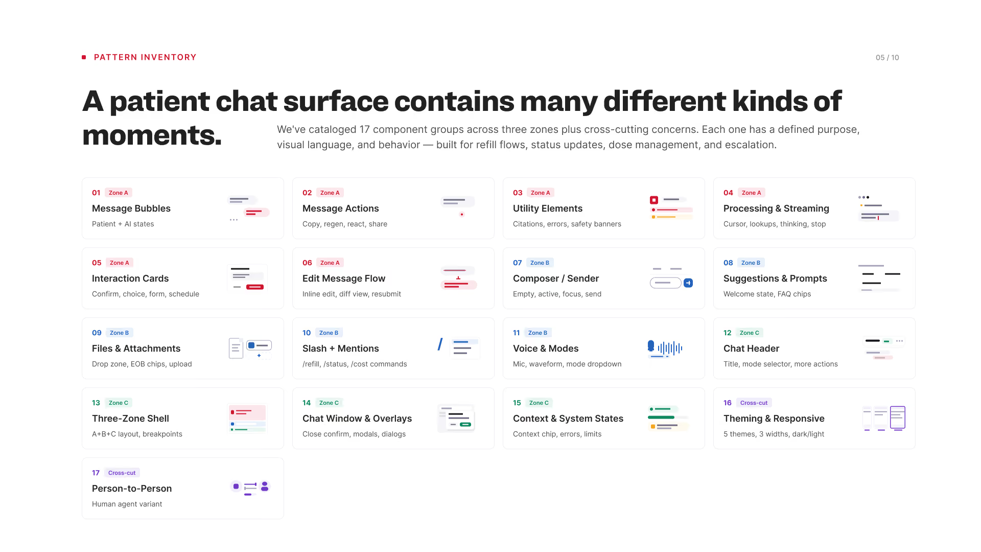
Strategy first, then architecture, then contracts. Three conversation types — proactive, reactive, guided task — defined what the chat is (a guide, not a form) and what it is not (a broadcast channel or a clinical advisor). Three zones structured the surface: read, act, type. And the AI was put under contract: it emits structure, not markup, so design owns the look, engineering the wiring, AI the content, and clinical the safety rails.
A good-better-best build framework meant every pattern carried forward across tiers. Nothing was throwaway work.
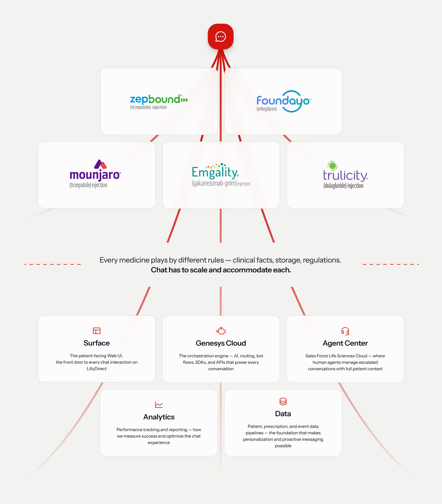
Chat is one part of a five-part system, drawn that way from day one: the Surface patients see, Genesys Cloud for orchestration, the Agent Center on Salesforce Life Sciences Cloud for the humans, Analytics to tune it, and the Data that makes it personal.

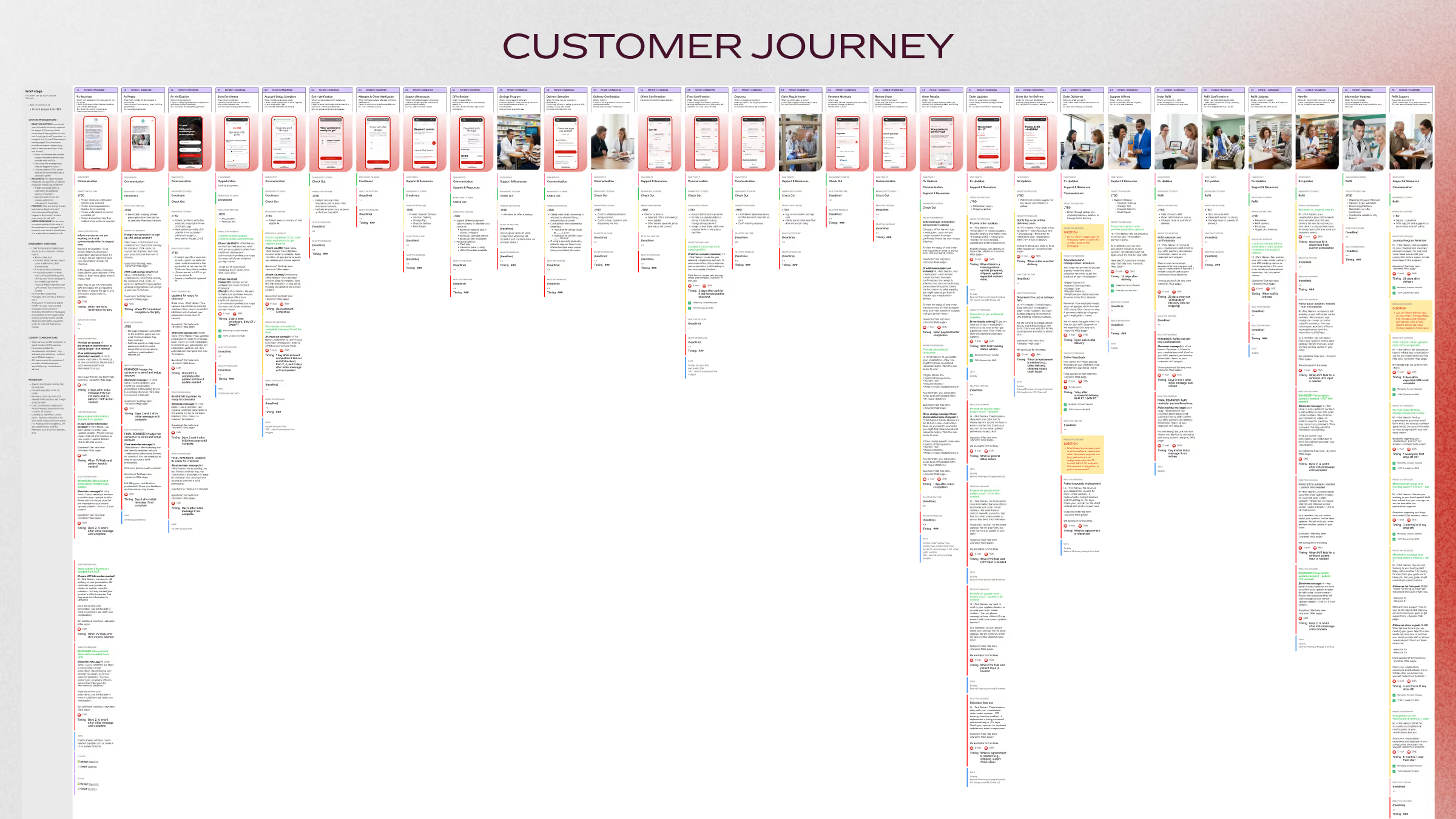
A known path for every way a patient asks.
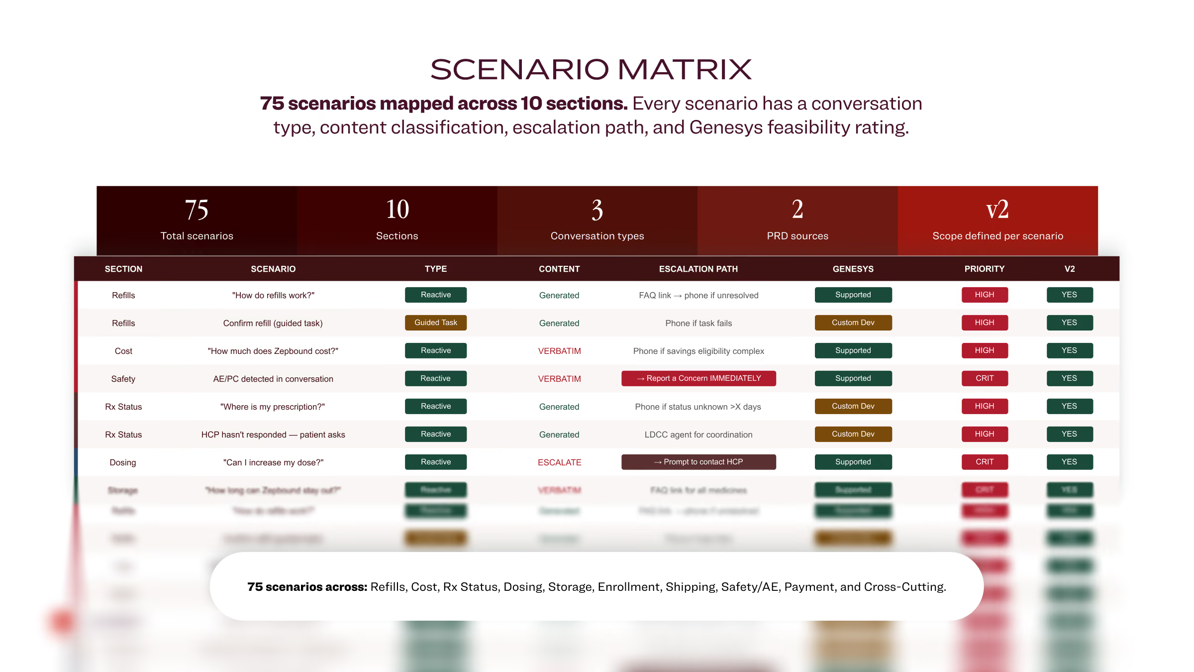
No two patients ask the same way. The matrix turns that into a finite set of known paths: 75 scenarios across ten need areas, from refills and prescription status to cost, dosing, shipping and safety. Each row decides who starts the conversation, whether the AI may compose or must use approved wording, where it escalates, what the platform supports out of the box, and what ships first.
Four conditions move a patient to a human.
A clinical or dosing question, a safety concern, two failed attempts at the intent, or a low-confidence match. The conversation travels with the hand-off, so nobody repeats themselves.
On-brand voice
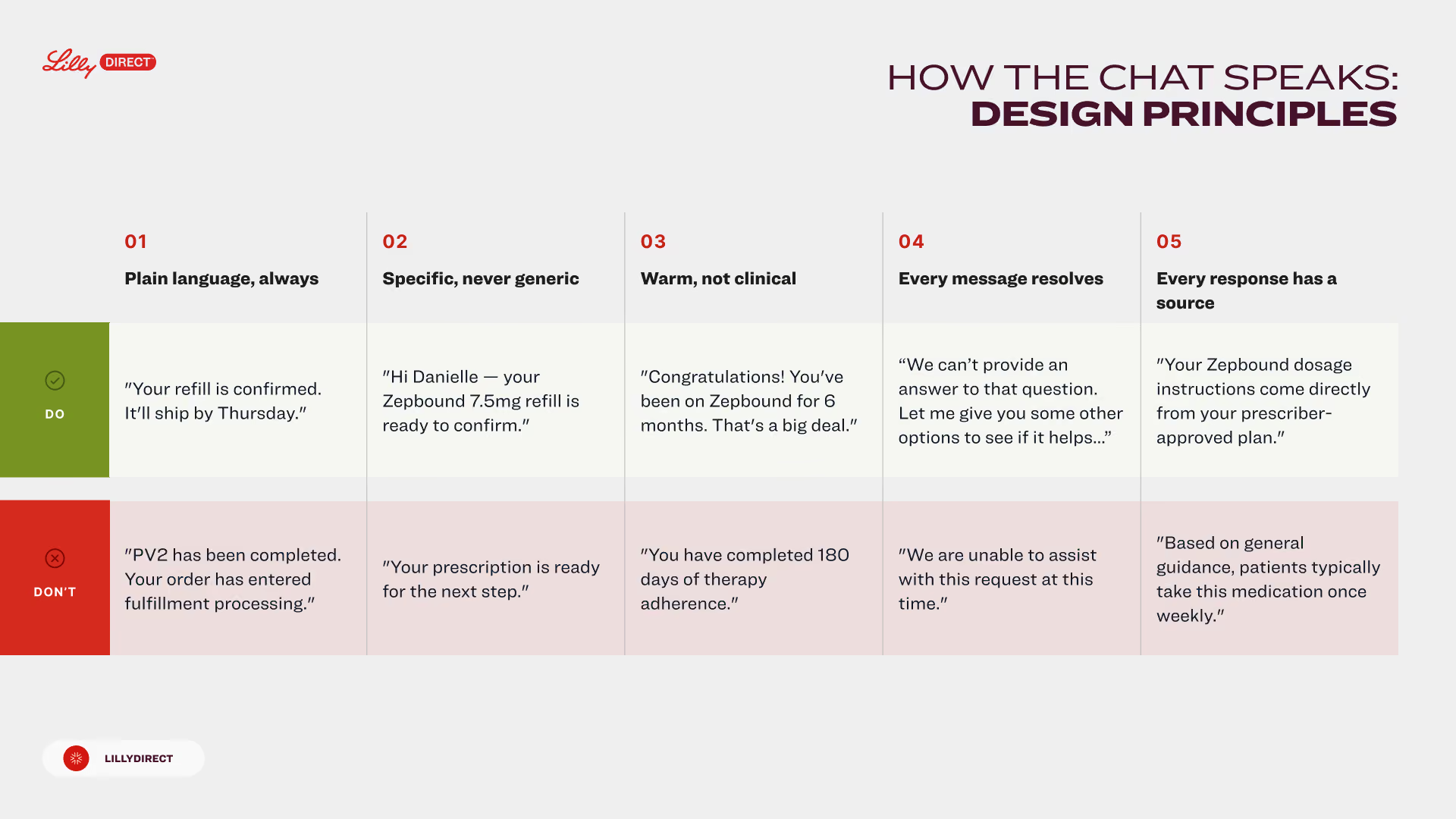
A patient on therapy is not a ticket. Five principles, each with a do and a don't, so every generated answer and every approved line sounds like the same person: plain, specific, warm, resolving, sourced.
The principles are also the rule for the AI. Generated answers are checked against them, and the escalation lines follow them too — never “I can’t help with that” without a next step.
Parts and pieces for a scalable chat experience
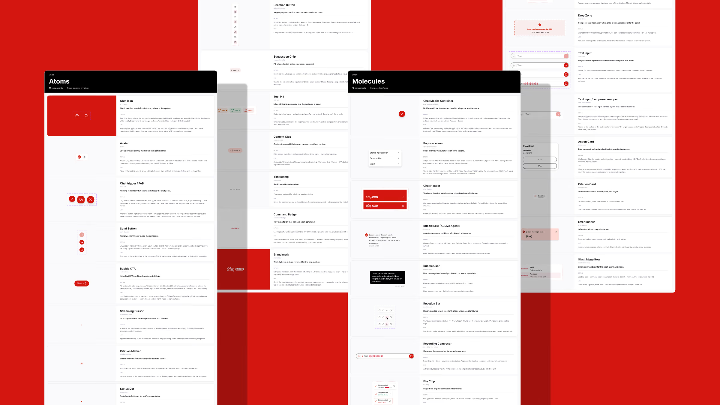
A component layer on top of Lilly’s enterprise design system: 30 components, each documented with its purpose and the rules for where it appears. It was the team’s first product-level library, so every support pattern carried forward instead of being rebuilt.
The agentic parts are what a generic chat kit lacks: a tool pill that shows a lookup running, a streaming cursor, a citation that opens its source, and the action card — a contract between the AI and the interface, auditable and reversible before anything commits.
Interface
One red trigger on every page, and a conversation that opens without taking the page away. Two ways in on desktop, the trigger's hover behavior, and the mobile takeover — each clip is the working prototype.
Concept A: Traditional
The familiar chat widget: tap the trigger, a panel opens in the corner, the page stays put. Why it is an option: people already recognize it. Zero learning curve, lowest risk, fastest to ship — and a safe baseline to measure the bolder concept against.
Concept B: Side Panel
Tap the trigger and the page steps back while a full-height panel slides in. Why it would be awesome: focus and real estate. The conversation gets room for richer, interactive moments — order cards, refill actions, a hand-off to a human — instead of a cramped bubble, and the receding page signals that this is the task now. Same components as A, so it is a layout decision, not a rebuild.
Hovers
Two personalities for the trigger: "Smooth operator" eases, "Switch" flips state. It is the only piece of the chat on every page, so the hover is the first promise of how the whole thing will feel.
Mobile Web
On a phone the same trigger opens a full-screen takeover and closes back to where the patient was. Most patients will meet the chat here, one-handed and mid-task — one surface, one way out, same components as desktop.
The same agent, on both sides of the hand-off.
When one of the four conditions fires, the conversation changes hands instead of ending. The thread, the context and the prescription state arrive in the Agent Center on Salesforce Life Sciences Cloud, so a human picks up mid-sentence.
The AI stays in the room. Call Assistant drafts the next response with its sources for the agent to send or edit; Agent Support answers the agent’s own questions from the record. Same voice, same sources rule, now serving the person who serves the patient.
The transcript · the matched scenario and why it escalated · prescription and fulfillment state · the suggested next response, with its source. Nothing reaches the patient without a human choosing to send.


KPIs
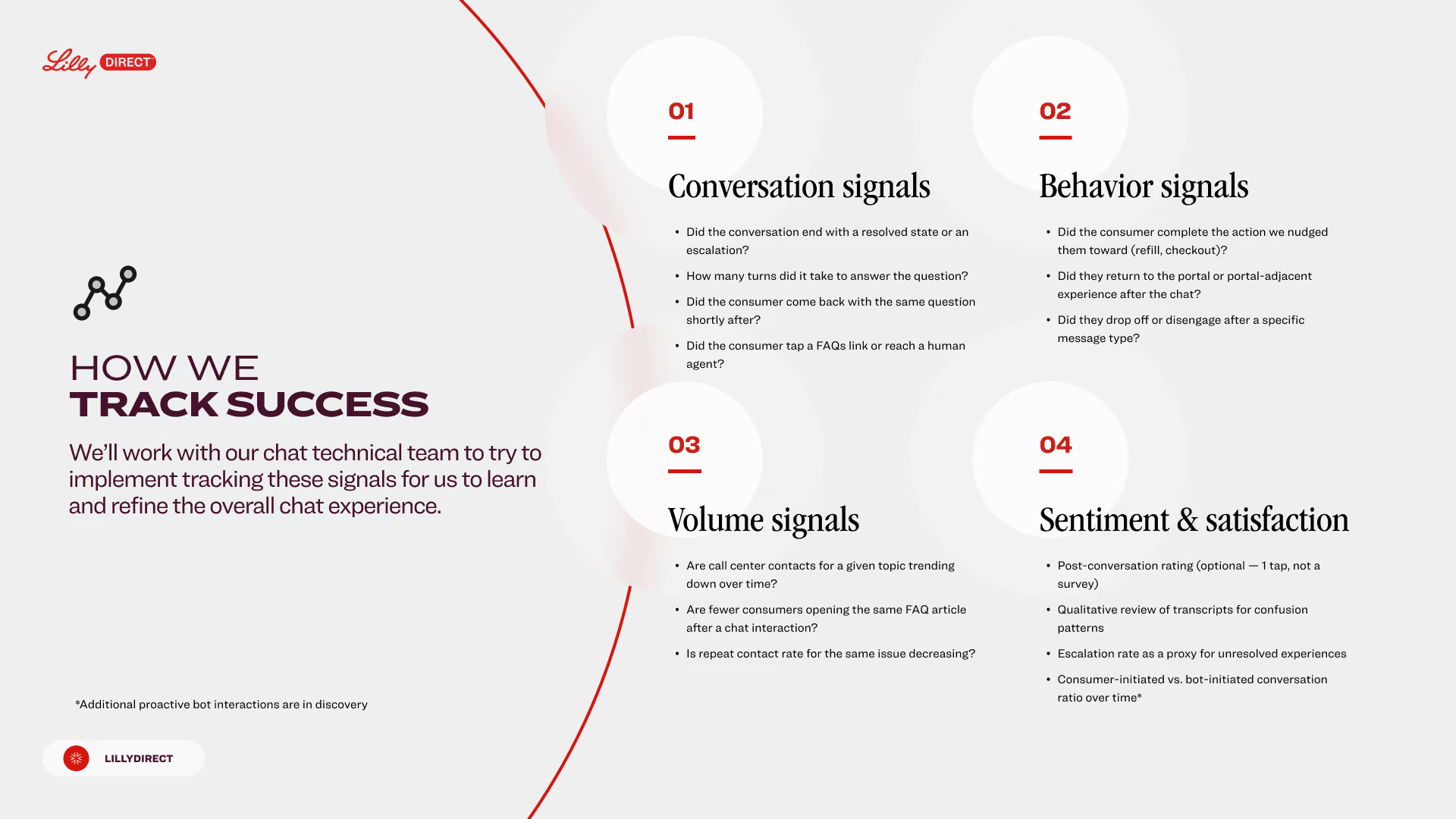
In-market numbers arrive after launch. What was defined before it is the measurement frame, agreed with the chat technical team: four groups of signals, instrumented from the conversation itself rather than from a survey.
scenarios mapped across 10 need areas
components in the chat design system
pattern groups across 3 zones
signal groups in the measurement frame
Design-phase indicators. The product launches with LillyDirect; in-market resolution, deflection and satisfaction numbers will be added after release.
What landed
- Chat strategy: channel roles, three conversation types, and the 75-scenario matrix with escalation paths, feasibility and release scope
- Tone of voice: five principles with do and don’t pairs, applied to generated, verbatim and escalation copy
- Interaction architecture: three zones, 17 pattern groups, 80-plus states, WCAG 2.1 AA per element
- Card contracts: AI emits structure, design controls the rendering
- The chat design system: 30 documented components on Lilly’s enterprise system; the team’s first product-level library
- The experience: activation concepts, hovers and the mobile takeover, prototyped
- The hand-off: the Agent Center console on Salesforce Life Sciences Cloud, with Call Assistant and Agent Support
- The measurement frame: four signal groups, instrumented with the chat technical team
Status: pre-launch.
Reflection
In healthcare, visible machinery is trust.
Showing the AI’s work, lookups, sources, states, isn’t transparency theater. It’s what makes patients feel safe.
Cards are contracts.
When AI emits structure instead of markup, design, engineering and clinical each keep their authority, and the system scales.
A voice is a spec.
Five principles with examples did more for consistency than any style guide, because the AI and the writers were checked against the same lines.
Escalation is a designed outcome.
The hand-off to a human is a feature with its own experience, not an admission of failure.